Brand identity for Zionn Designs
An interior design, lighting and fixtures studio. One monogram had to carry two things at once — the geometry of a planned space, and the light that makes it work.
Concept Structure meets light
- Role
- Brand designer — sole
- Client
- Zionn Designs
- Sector
- Interior design · Lighting
- Deliverable
- Monogram, wordmark, colour
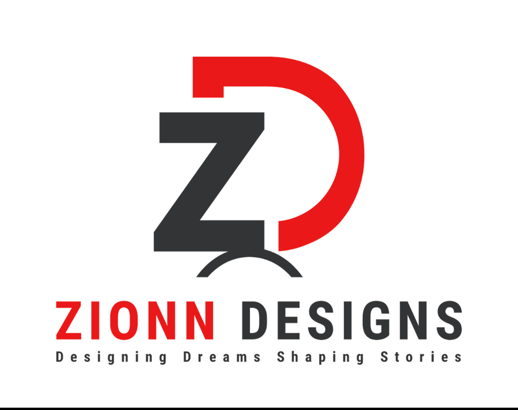
Interior design · Lighting · Fixtures
The problem with a three-service studio
Zionn does interior design, lighting and fixtures. Most studios in that position pick one thing for the logo and hope the other two are implied — usually a house outline, sometimes a chair, occasionally a bulb. All three are generic, and none of them says what this studio is actually good at.
The brief I worked to: one monogram, two ideas, no house and no bulb. It had to survive dark showroom photography, printed signage and a small favicon, and it had to look designed rather than decorated — the client sells taste, so the mark is the first proof of it.
The idea: Z is structure, D is light
The Z, in charcoal
Angular, built, planar. It carries architecture, spatial planning and the discipline of a drawn floor plan.
The D, in red
An open curve — the shape of a shade, a reflector, a wash of light on a wall. It carries illumination and warmth.
The arc beneath
The pool of light a fixture throws. It also seats the two letters on a common baseline so the lockup reads as one object.
Exploration
Eight literal directions before the letterforms were allowed to carry it alone. The left columns put actual fixtures inside the monogram — a pendant over the Z, a wall sconce, a cluster of three, a room section seen through the D. Each one worked as a drawing and failed as a mark.
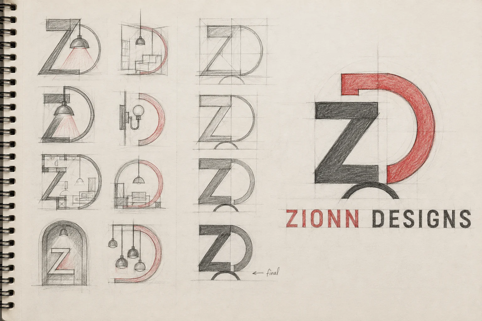
What the reduction column is doing. Each pass removes a piece of scenery. The room goes, then the pendant, then the cord, until what's left is a Z, a D and one arc — and the mark finally says "light" through form rather than through illustration. The version marked final is the first one that would still read at the size of a business card.
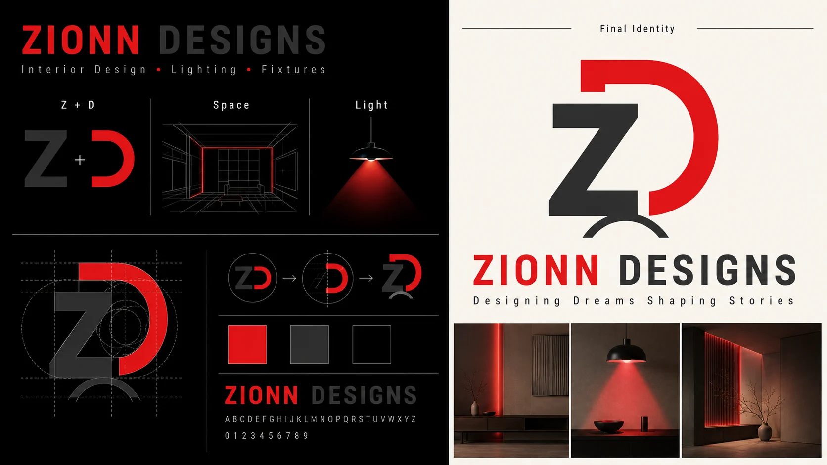
Construction and system
Colour
Values sampled from the artwork — confirm the exact hexes against the source file before they go into a brand sheet.
Typography
Tracked-out geometric caps, split tonally the same way the monogram is: ZIONN in red, DESIGNS in charcoal. The tagline — Designing Dreams, Shaping Stories — sits under it in a lighter weight with wide letterspacing, so it reads as a line of atmosphere rather than a second title.
What I did
- Concept and positioning
- Sketch exploration, 8 directions
- Monogram construction
- Wordmark and tagline lockup
- Colour and applications
Ruled out
- House outline
- Light bulb
- Furniture silhouette
- Literal room sections
Deliverables
- Primary lockup
- Monogram
- Wordmark + tagline
- Colour values