Logo rebranding for Dr Patrick Antony
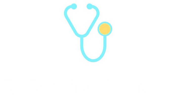
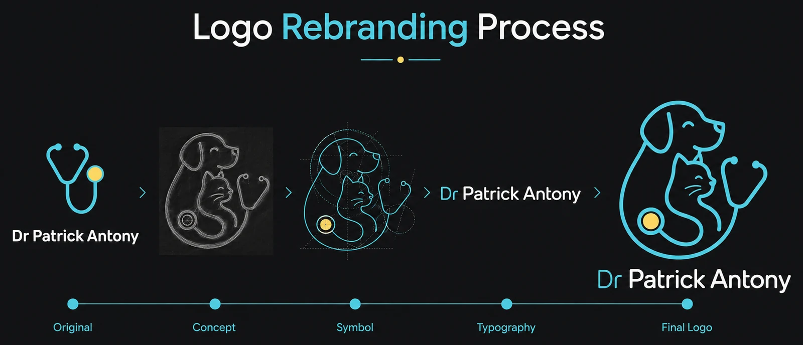
The original identity was a stethoscope. Accurate, legible, and interchangeable with every clinic on the street. This is how it became something only this practice could own.
Concept Compassion in every connection
- Role
- Brand designer — sole
- Client
- Dr Patrick Antony
- Type
- Self-initiated concept
- Deliverable
- Symbol, wordmark, lockup
What was wrong with the original
It wasn't badly drawn. It was unowned. A stethoscope is the most-used symbol in medical branding — it appears on GP surgeries, dental practices, insurance products and hospital signage. It communicates "medicine" and stops there.
Run the simplest identity test on it: cover the name and ask what kind of business this is. Nothing in the mark says animals. Nothing says this practice. And the wordmark was a default bold sans with no relationship to the symbol above it — two elements sharing a canvas rather than a lockup.
The brief I set myself
- Say animals and medicine in one mark — not a symbol with an animal added next to it.
- One continuous line, one weight — so it reproduces cleanly and reads as a single idea.
- No cross, no paw print, no heart. The three defaults of veterinary branding, and the reason most vet logos look like each other.
- Friendly without becoming a cartoon. This is a clinic; people bring frightened animals to it.
- Survive scale and single colour — signage down to stationery.
Exploration
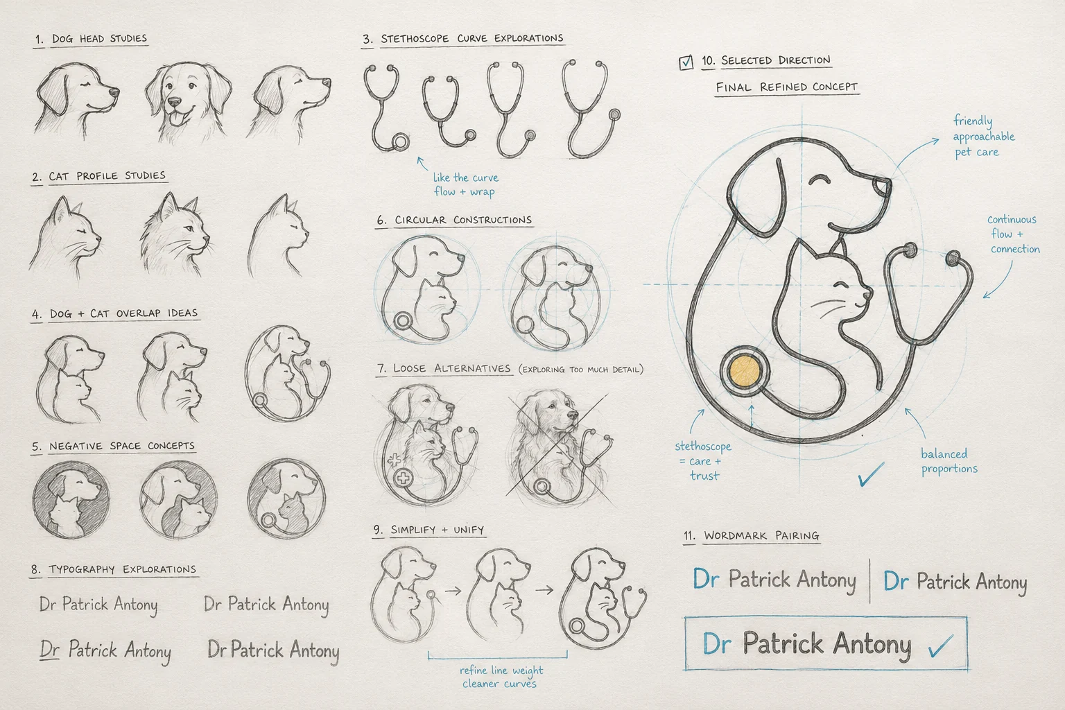
Eleven groups of studies before anything went into vector. The point of the sheet isn't the drawings — it's how many directions had to be tried and thrown away before the obvious one appeared.
01 · Finding the fewest lines
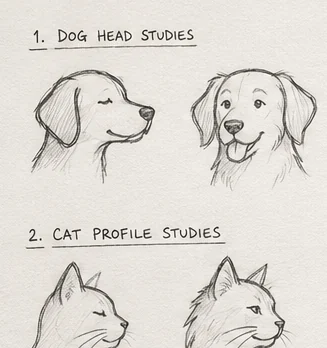
Dog and cat profiles, drawn repeatedly to find the minimum that still reads as each species. A dog is its muzzle and ear; a cat is its ear triangles and the dip of its nose. Everything else is optional.
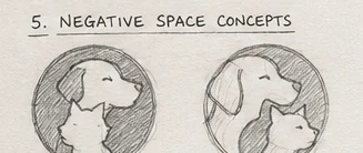
02 · Two animals, one silhouette
Negative-space and overlap studies, testing whether the dog and cat could share a single outline instead of sitting side by side. This is where the curled composition came from — the cat nested inside the dog's body rather than beside it.
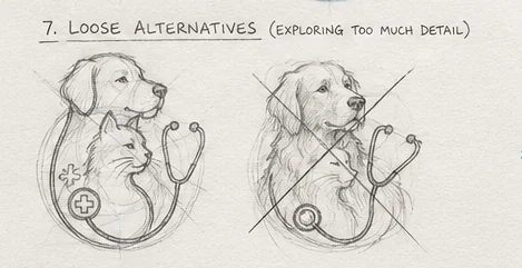
03 · The direction I killed
Worth showing because it's the better drawing and the worse design. The rendered retriever has more craft in it, and it fails everything the brief asked for: it collapses below poster size, it can't be reproduced in one weight, and it fights the flat interface it has to live inside. The version beside it added a medical cross — the exact cliché the brief ruled out.
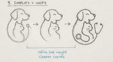
04 · Simplify and unify
Three passes, each removing something. Consistent line weight, cleaner curves, and the stethoscope tubing extended until it closes the composition into one loop rather than hanging off it.
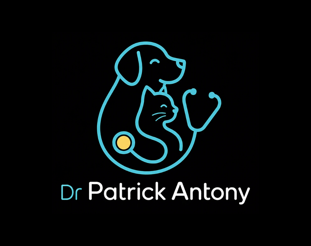
05 · The selected direction
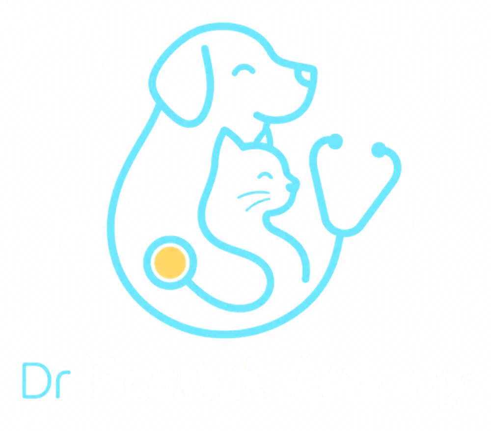
Built on circular construction guides so the outer arc, the dog's back and the stethoscope tubing all sit on related curves. The diaphragm lands where a collar tag would — a detail that does double duty as medical equipment and pet ownership.
06 · Pairing the wordmark
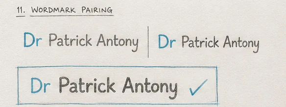
Four pairings tested. The chosen one splits the lockup tonally: Dr in cyan carries the medical authority, Patrick Antony in the heavier weight carries the name people actually remember and say. The rounded terminals echo the curves in the mark, so the two elements belong to each other.
What the mark means
The dog
Loyalty, companionship, trust — and the outer form the whole composition sits inside.
The cat
Care, comfort, sensitivity and independence. Nested, not secondary.
The stethoscope
Clinical expertise and diagnosis — the practice, not just the affection.
One continuous line
The relationship between vet, pet and pet parent, drawn without a break in it.
The circular form
Protection, complete care, and a practice you stay with rather than visit once.
The closed, smiling eyes
A calm visit. The single detail that decides whether a clinic reads as reassuring or clinical.
Colour
Typography
A rounded sans, chosen to sit between two failure modes: corporate enough to be trusted with an animal's health, warm enough that a worried owner doesn't feel processed. Friendly without tipping into childish — the trap most pet brands fall into.
It has to work on a clinic sign read from a car, on a phone screen at 1am, and on a printed vaccination card. That rules out anything with fine strokes or tight counters.
Original to final
What I did
- Competitive read of vet marks
- Sketch exploration, 11 groups
- Symbol construction
- Wordmark pairing
- Colour and rationale
Ruled out
- Medical cross
- Paw print
- Heart
- Rendered illustration
Deliverables
- Primary lockup
- Symbol
- Wordmark
- Colour values