01 · Foundation
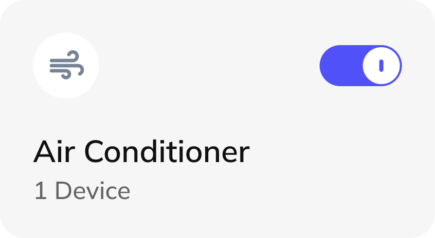
The device card
Icon, state, name, count. Four fixed slots let any device type drop into the same shape, with the primary control always in one predictable place.
Smart-home control is scattered across an app per manufacturer. CoShell pulls rooms, devices and climate into a single dashboard — and, underneath it, a component set built so the system can keep growing.
Concept Calm control of a complicated house
A house with smart devices in it usually means a phone with an app for each brand. Turning off the lights, checking whether the air purifier is still running and nudging the temperature are three separate journeys through three different interfaces, each with its own idea of what a toggle looks like.
The result is that people stop using most of what they bought. The devices work; the control layer is the thing that fails.
One dashboard where the whole house is legible at a glance, and the three things people actually do — check status, flip something on or off, change the temperature — are each one action away.
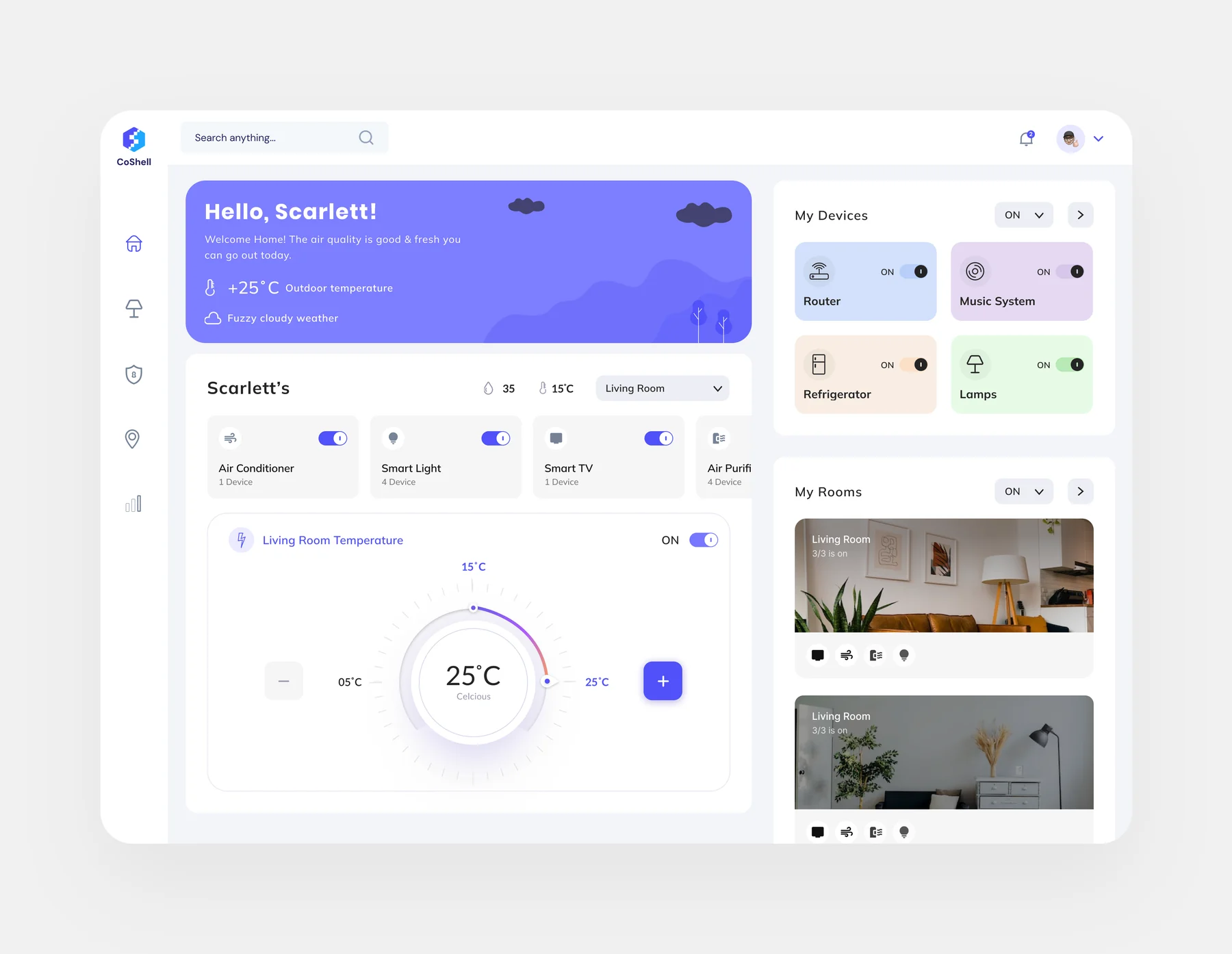
The screen is organised by how often you need something rather than by device type: the greeting and outdoor conditions at the top, device categories in a scannable row, the climate control given the largest single element on the page, and rooms and individual devices in a right-hand column you scan rather than read.
Every card shows its state in the resting view. Nothing needs to be opened to find out whether it is on.
The toggle is on the card, not behind it. The most common action costs one click from the home screen.
Temperature is the most-adjusted setting in a smart home, so it gets the biggest control on the page rather than a row in a list.
Rooms use photographs, not icons — people recognise their own living room faster than they parse a label.
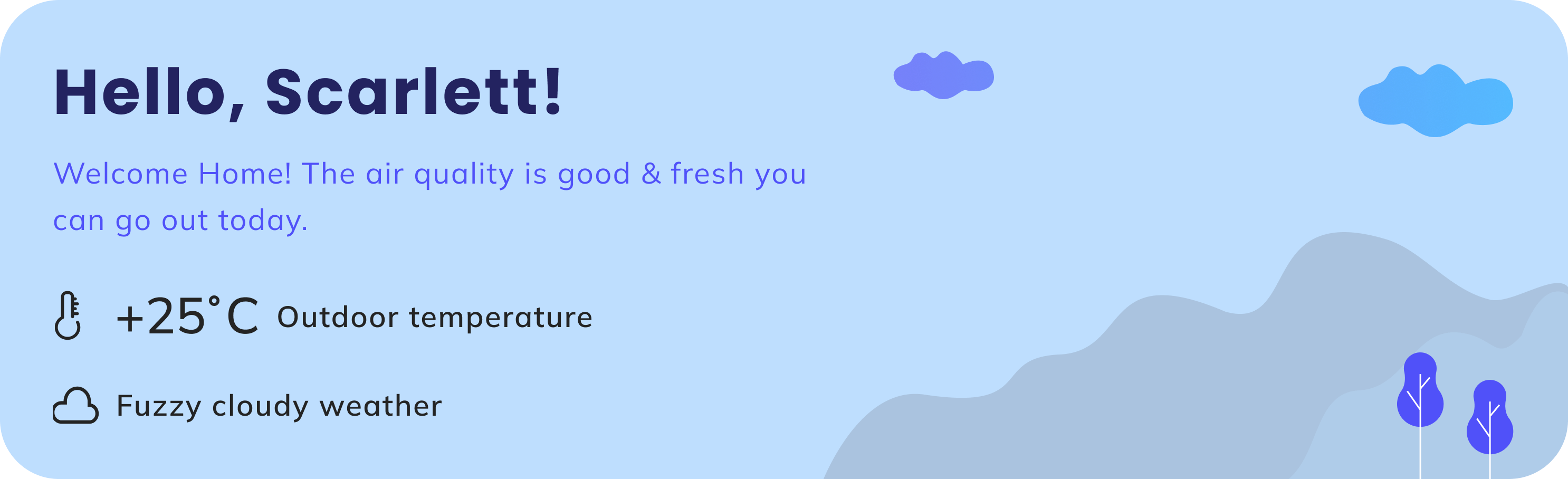
The banner does something more useful than say hello: it answers the question you'd otherwise open a second app for — what's it like outside, and is the air worth opening a window for.
The dashboard is the visible half. The half that decides whether it survives contact with a second designer is the component set underneath — one card, one toggle, one icon family, one colour rule.
Icon, state, name, count. Four fixed slots let any device type drop into the same shape, with the primary control always in one predictable place.
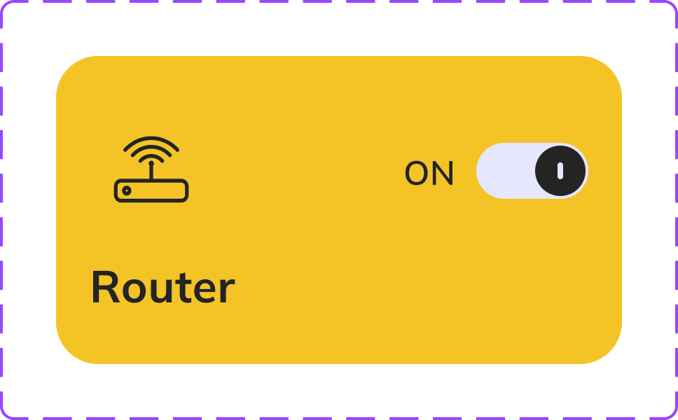
The router variant shows how category colour can make a device scannable without changing the component's structure or control placement.

The same card carries different icons, labels and counts. Four devices are on and one is off, so the overall state remains readable without inspecting each card.
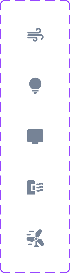
Solid glyphs share one weight and optical size. A drawing rule makes the set extensible as support grows across more devices.
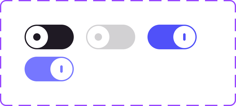
On, off, disabled and tinted variants for the most-used control in the product. Each state needs one meaning everywhere it appears.

A compact geometric mark carries the product identity into navigation, loading states and compact application surfaces.
Router, audio, lighting and appliance symbols share the same outline construction for consistency across coloured cards.
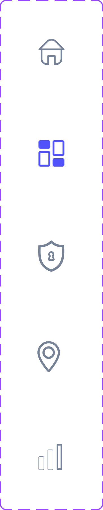
Home, dashboard, security, location and analytics share a restrained outline style, with indigo reserved for the active destination.
Generous spacing, large corner radii, an indigo accent and a pastel category range. The intent was to make a technically busy system feel calm — a house has a lot going on in it, and the interface shouldn't add to that.
The one deliberate exception is the temperature dial: it's the largest, most detailed object on the screen, because it's the only control people adjust by feel rather than by decision.
Usability testing on the three core tasks, an accessibility pass on the toggle contrast and focus order, responsive behaviour below desktop, and real-device feedback states — what happens between tapping a toggle and the light actually coming on.