Dr Pet: booking a vet at 1am, and arriving prepared
A concept for late-night veterinary care, researched with six pet owners and designed as two connected apps — one for the owner, one for the vet.
- Role
- Sole designer — research, UX, UI, brand
- Year
- 2022
- Type
- Self-initiated concept
- Research
- 6 user interviews
Two apps, one appointment passing between them.
The problem
Pet emergencies don't keep office hours. A cat stops eating at 11pm, a dog won't stop scratching at 1am, and the owner is left guessing: which clinic is open, which vet treats this species, what it will cost, and whether it can wait until morning.
And when they finally get seen, the consultation starts from nothing. The vet asks what happened, when it started, what the animal ate, how long it's been going on — questions the owner has already answered in their head a dozen times while waiting. Both sides lose time at the worst possible moment.
Research
Research goal: understand the needs and pain points of pet owners when they take their pets to a clinic during late nights.
I ran six user interviews from a guide prepared beforehand. Participants were aged 21 to 38, all pet owners, with professions ranging from HR manager and anchor to product designer and iOS developer.
The decision that shaped the product
Everything else in this concept follows from one choice: collect the symptoms while the owner is booking, not when the consultation starts.
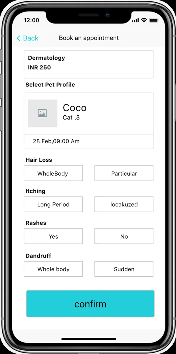
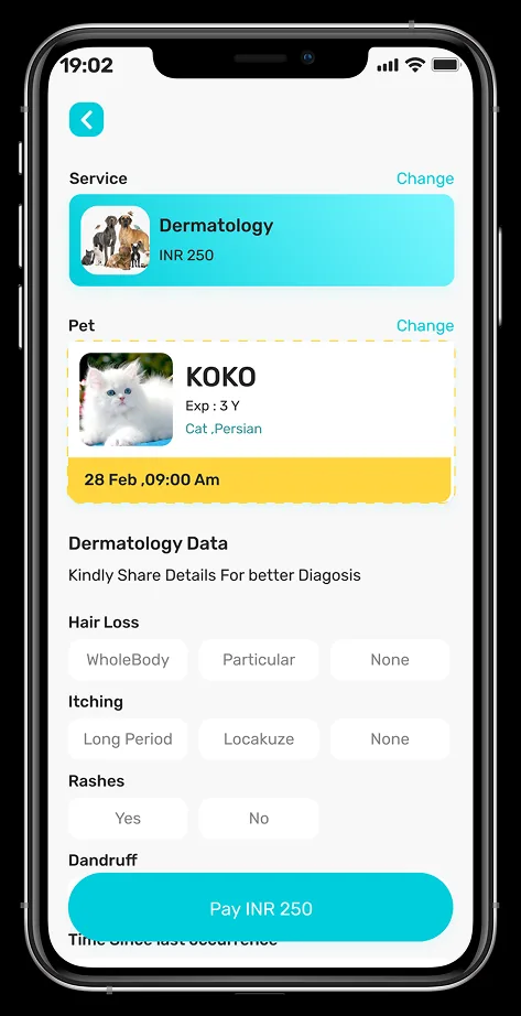
After picking a service, the owner answers a short structured set — hair loss (whole body, particular area, none), itching (long period, localised, none), rashes, dandruff, time since the last occurrence, what the pet has eaten, and a photo of the affected area. It takes a handful of taps.
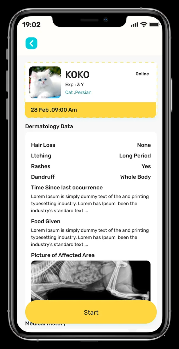
The vet then opens that appointment and sees all of it, alongside medical history, before pressing Start.
Why structured, not a free-text box. At 1am a worried owner types "he's scratching a lot", which tells a clinician almost nothing. Constrained options produce something a vet can actually triage on — and tapping four chips is faster than typing a paragraph one-handed while holding an anxious animal.
From wireframe to final
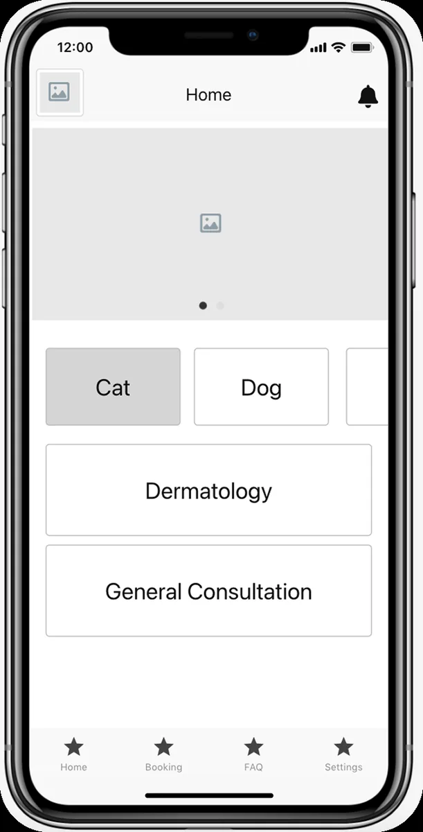
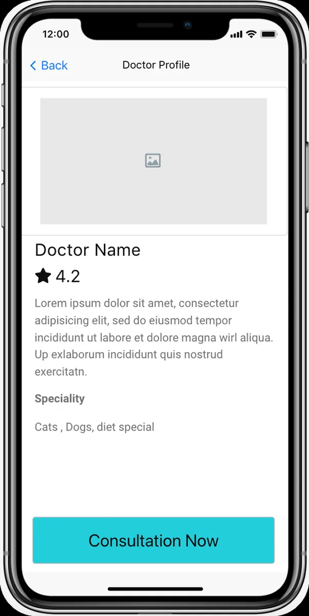
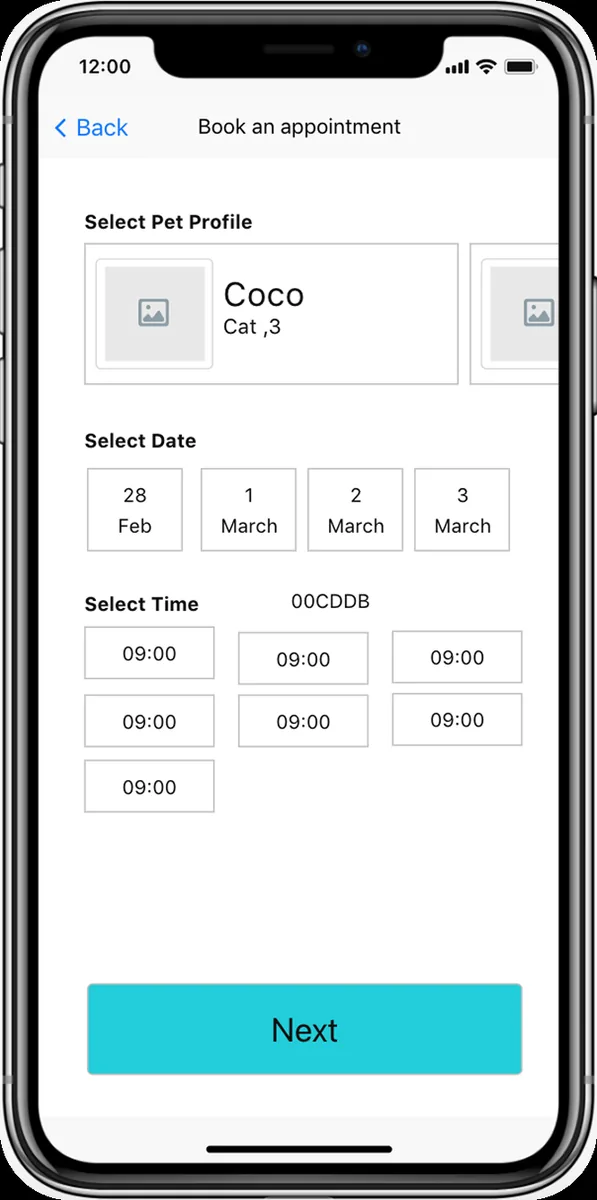
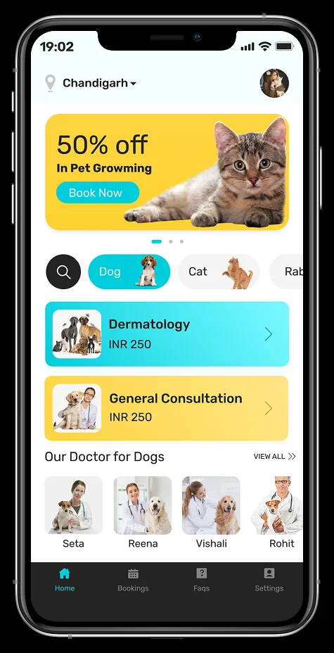
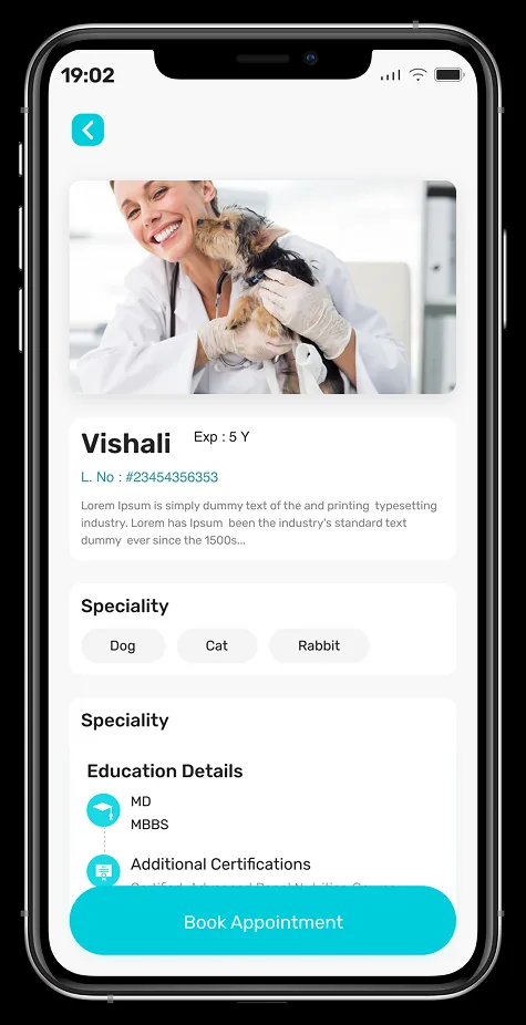
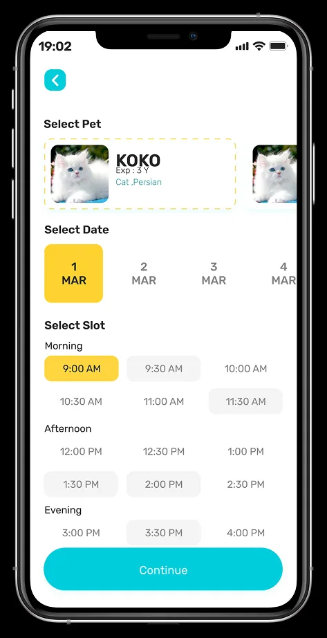
The same four owner-side screens, at low fidelity and shipped fidelity. The structure was settled in grey before a single colour decision was made.
The other side: the vet's app
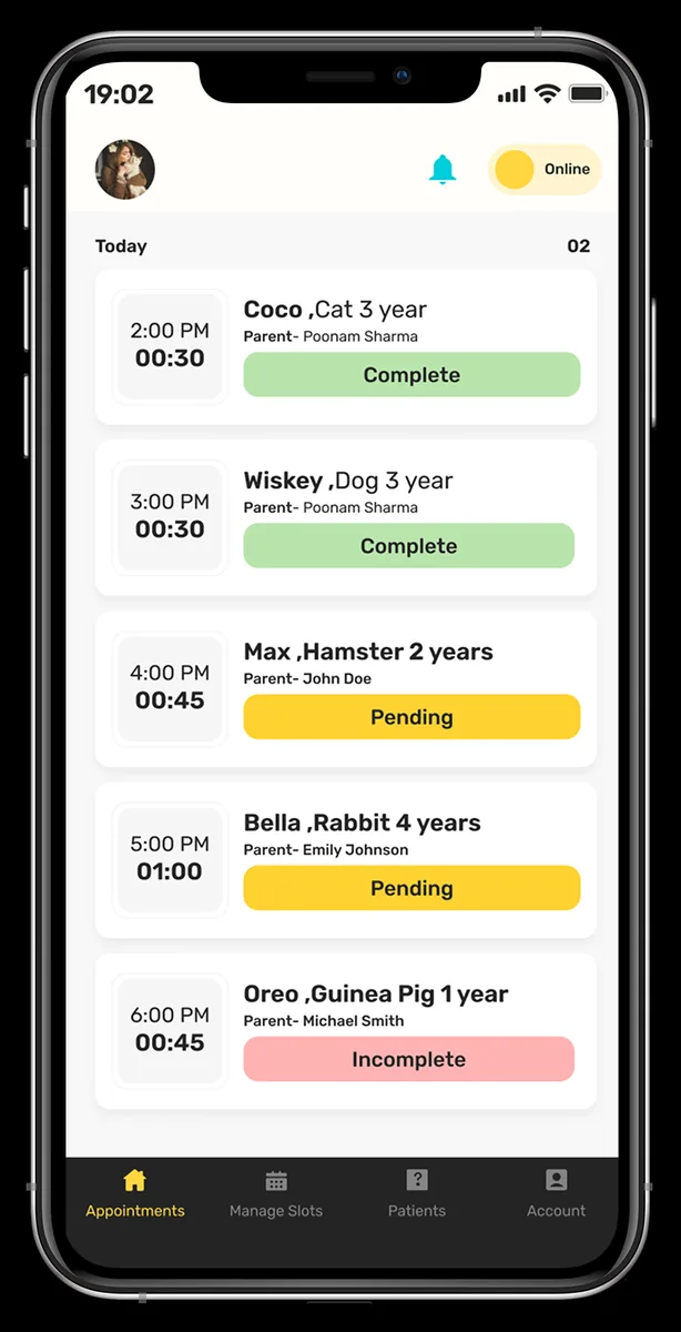
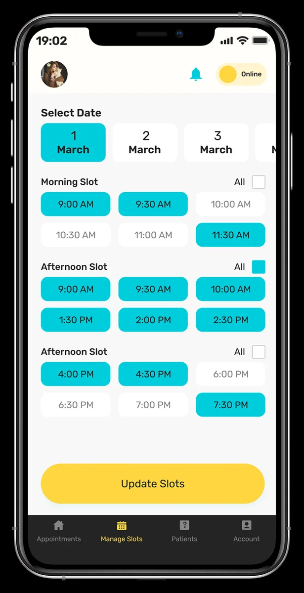
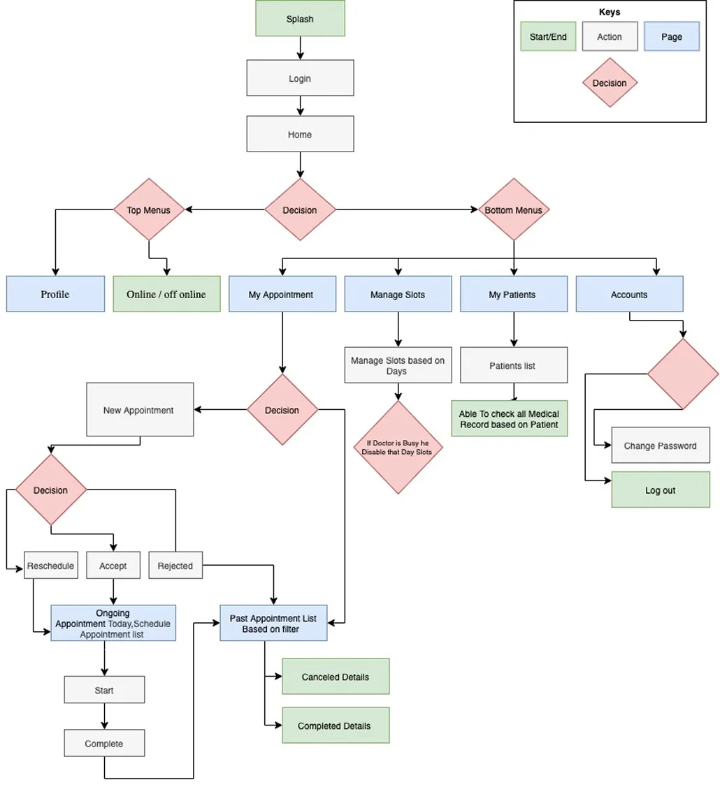
A booking product is only half designed if you stop at the person booking. The vet needs to control availability, work a queue, and start a consultation already informed.
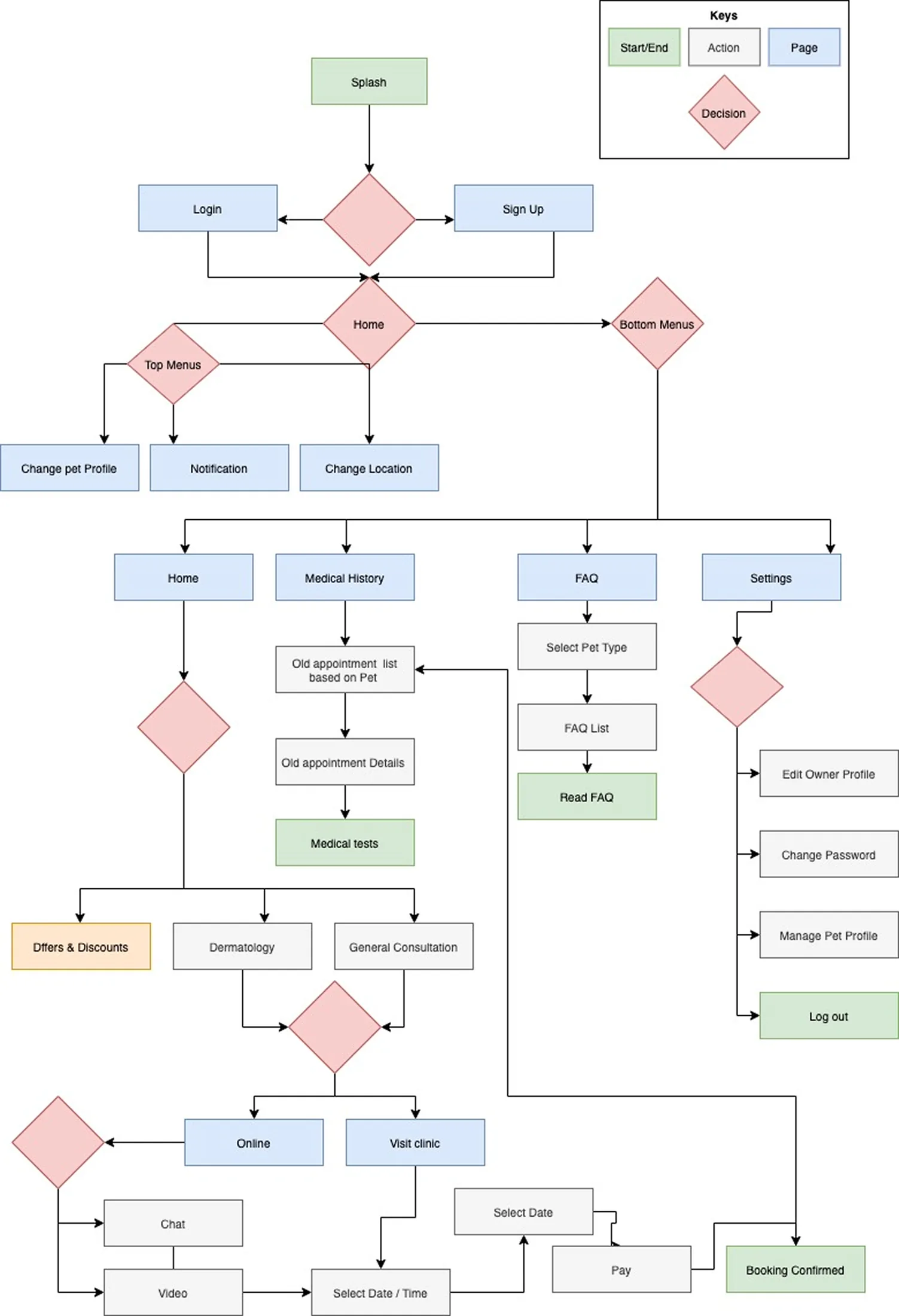
The flow underneath
Two journeys, drawn separately, because the two apps have almost nothing in common except the appointment that passes between them. The owner is booking once; the vet is working a queue all day.
The original working diagrams
Brand and UI system
The clinic had no identity at all, so the mark came first: a dog and a cat drawn as one continuous line, with the stethoscope tubing closing the loop and its diaphragm sitting where a collar tag would. One drawing that says both species and medicine — no cross, no paw print, no heart. From there, a four-colour system and one typeface at five weights, enough to build both apps without inventing anything twice.
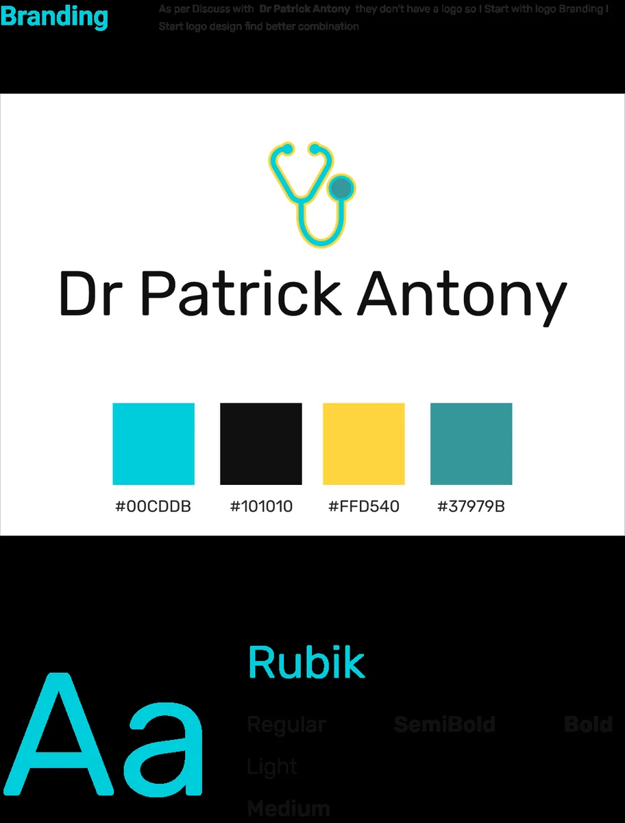
Rubik
One family across both apps. Geometric enough to feel clinical, round enough not to feel cold — the balance a pet-care product needs.
- Light 300
- Regular 400
- Medium 500
- SemiBold 600
- Bold 700
The original 2022 brand sheet
The first pass was a plain stethoscope on its own. It was legible but generic — it could have belonged to any clinic. The animals came in on the revisit, and the palette and type held.
Two products
- Pet owner app — discover, book, pay
- Vet app — availability, queue, consultation
What I did
- User interviews (6)
- User flows, both sides
- Low-fidelity wireframes
- Final UI, both apps
- Logo, colour and type
Species covered
- Dogs · Cats · Rabbits
- Hamsters · Guinea pigs