Lfty: putting content on a lock screen without ruining the lock screen
Intex wanted a revenue surface on the phones it sold. What it had was the lock screen — the most-seen screen on any handset, and the one nobody opens on purpose. Lfty turned it into a news, entertainment and offers layer, and shipped preloaded on Intex Android phones in 2017.
Shipped Preloaded on Intex Android handsets, 2017 · Designed at Signity for Intex Technologies (India) Ltd
- Role
- Sr UI/UX designer — owned the product design
- Client
- Intex Technologies (India) Ltd
- Surface
- Android lock screen + left panel
- Status
- Shipped preloaded, 2017
The problem
A phone maker earns once, at the till. After that the handset is in someone's pocket for two years generating nothing. Intex, like every Indian OEM in 2016, was looking at the one piece of screen it still controlled after the sale — and the lock screen is the piece everybody looks at and nobody visits.
The commercial brief was straightforward: a content and promotion layer, with buying and opting available from the screen itself, programmed by day and by behaviour, with room for several business verticals to sit in it.
The design problem underneath it was harder, and it was not the one in the brief. Nobody installs a preloaded app. There is no download, no rating, no moment where the user agrees to any of this. If the screen annoys them, they don't blame Lfty — they blame the phone. And they cannot uninstall it.
So the whole product rested on one uncomfortable fact: this thing had to earn its place on a screen it had already taken.
The rule I designed against
A lock screen has exactly one job: get you into your phone. Everything Lfty added was, strictly speaking, in the way of that job. So the constraint I set was that the content had to be free — free in the sense that ignoring it costs nothing. Not one extra tap, not one extra second, not one pixel of the swipe path.
That single rule killed the two directions the brief invited. A full-screen content takeover was the obvious way to sell more inventory, and it made the phone slower to open — dead. An auto-rotating promotional wallpaper looked impressive in a deck, and it replaced the photo of somebody's child with an advert — dead.
What survived was quieter: content that lives in the margins of the screen, above and below what the user came for.
Unlocking is never blocked
The swipe path and the camera shortcut stay clear on every variant. Content sits above or below them, never across.
The middle of the wallpaper stays free
The centre band is where people put the photo they chose. Covering it is exactly how a preloaded app gets hated.
One tap, one swipe
No long-press, no double-tap, no gesture that has to be taught. In 2016 a large share of these handsets were somebody's first smartphone.
Legible over a photo I don't control
Nothing sits directly on the wallpaper. Every string gets an opaque carrier behind it — a band, a card, a capsule.
Four variants of one idea
The real argument on this product was volume: how loud should a headline be on a screen the user did not ask for content on? I designed the same layer at three levels of insistence rather than defending one in a meeting.
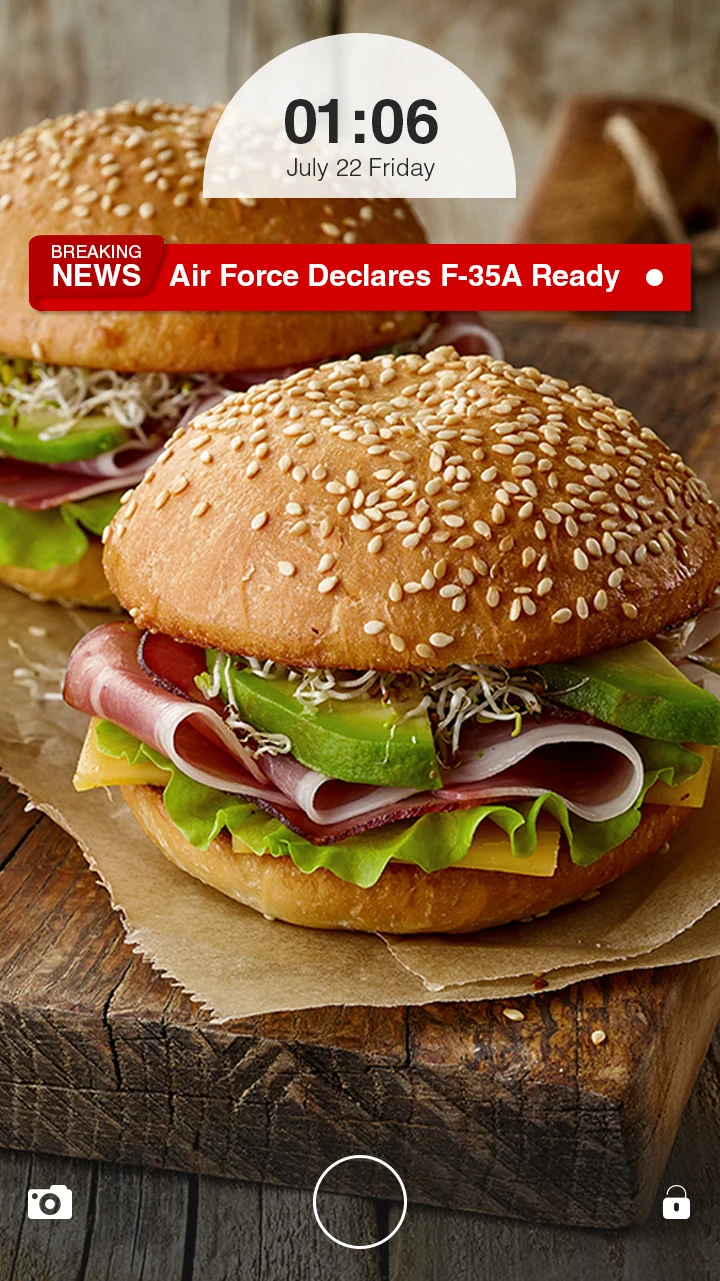
Loud — The Red Band
Full-bleed red, white headline, and a live status dot. Maximum read rate, and the version most likely to be resented. It works because it is only two lines tall and sits directly under the clock capsule where the user's eye already lands upon wakeup.
The left panel
One swipe from the home screen sat the other half of the product: the discovery surface, where the content had room to be content rather than a headline in a bar.
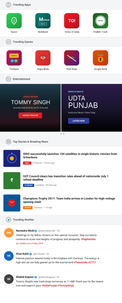
Trending Apps Section
Row of 4 high-priority app tiles (Saavn, Mobikwik, Times of India, Prakriti Fresh). Designed for 1-tap instant installs directly from the lock screen, bypassing Google Play Store friction for first-time smartphone users.
Trending Games Section
Casual gaming shelf featuring bite-sized titles (Tambola, Angry Birds, Fruit Ninja, Jungle Book). Engineered to drive daily replay frequency without consuming heavy storage on 8GB handsets.
Entertainment & Media Carousel
Rich dark media cards for movie trailers and music drops (Udta Punjab / Tommy Singh) with direct WATCH TRAILER & LISTEN NOW CTA buttons. High-engagement promo cards programmed by dayparting.
Top Stories & Categorized News
Editorial news feed with category badges (INDIA ISRO 104 satellites, ECONOMY GST Council, SPORTS Champions Trophy 2017) and publisher timestamps tuned for 3G networks.
Trending #twitter Stream
Real-time Twitter social feed featuring verified accounts (Narendra Modi, Virat Kohli, Shahid Kapoor) with live hashtag links (#DigitalIndia, #TeamIndia, #UdtaPunjab) to reward casual browsing.
It is a shelf, not a feed, and that was a decision rather than a limitation. A feed asks the user to keep scrolling and keep judging. A shelf — section header, one row, next section header — can be read in a single pass and stops on its own. On a 1GB handset over patchy 3G, it also loads in bounded chunks instead of forever.
The sections are ordered by how quickly each one pays the user back: apps and games first, because installing something is the fastest useful outcome; entertainment next, because posters carry themselves; social last, because it is the section that rewards browsing rather than looking.
Where the money sat
I would rather say this plainly than let a portfolio imply otherwise. Lfty was a monetisation product. Brands could buy placement in it, offers carried a call to action that worked from the lock screen, and the content mix was programmed by day and by what the user had been doing.
The design job was to keep the commercial layer inside the same components as the editorial layer — same card, same band, same tap behaviour — so that a promotion could never be louder or harder to dismiss than a news story. That is the part I would still defend. What I would not defend is further down this page.
Interactive Brandbook & Design System
Live HTML and CSS implementation of the 2017 Lfty design system vector specs. Every component—from clock capsules to breaking news banners, sponsored offer cards, app category tiles and system control icons—built as modular vector elements for OEM lockscreen integration.
00 · Official Brand Identity Logo Mark & Wordmark Lockup

01 · Color Palette & Token Architecture
02 · Clock Capsule Components
03 · Breaking News Header Component
04 · Editorial News Card Component
ISRO successfully launches record 104 satellites in single mission from Sriharikota
Press Trust of India • 12m ago05 · Sponsored Offer Card Component
Diwali Special: Up to 50% Off Top Smartphones
Includes gifts worth ₹2,500 on pre-booking06 · Category App Chips (16px Radius)
07 · Lockscreen Vector Control Bar Icons
A note on what you're looking at
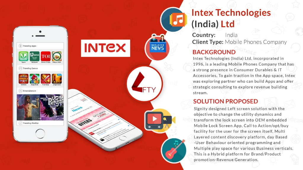
The working files from 2017 are gone. What survives is three lock-screen mockups and one client slide, and that is what is on this page — no reconstructions passed off as originals. The slide is the agency’s sales material rather than my design work, and it is here because the brief written on it is the thing the design had to survive; the left-panel screenshot is lifted from it. Both carry the real third-party apps and film posters that were live in the product at the time — evidence of what shipped, not work of mine.
What I did
- Lock-screen layer and variants
- Left-panel IA
- News band, card and clock components
- Commercial and editorial parity
- Visual design and handoff
Constraints
- Preloaded — no opt-in
- 720p, 1GB RAM handsets
- Patchy 3G, data-conscious users
- Many first-time smartphone owners
Focus areas
- OEM / system surfaces
- Attention and interruption design
- Ad and content parity
- Emerging-market constraints